Hello there. This is the first article of the series "From my point of Vue", where we are going to discuss, explore, learn about some interesting topics from a Vue.js perspective.
Today we are going to explore Headless components I would consider this a middle/advanced topic, so previous knowledge of Vue.js will be required to better grasp the examples, the concept though, is global and you can take advantage of this on any other framework.
Without more delay, let's start.
Introduction
While creating applications you will find yourself either doing the same components with the same logic many times with different User Interface(UI) or installing packages with an opinionated design that have a very different look from the design of your app. It shouldn't be so hard to customize simple components like inputs, labels, buttons but when it comes to complex components like Selects, Tabs, Step Wizards things might be a little harder if the component wasn't created with UI flexibility in mind, and here is where Headless components come to the rescue.
What are headless components?
In plain words, headless components are the ones that handle the logic and behavior separated from the UI, giving the responsibility of how the component looks to the developer.
The headless component can expose values and functions (state and controls) that will allow a child component to control certain parts of it and make UI desitions based on a state value. In other words, they are not attached to the UI but serves as support.
This gives a huge advantage to share components across projects where their design are very different or to add variations of the same component: an upload component that the upload files as a list or carousel of images for example.
Background
The concept is not new, it's been discussed and implemented for a couple of years, I first heard of it when Adam Watham, creator of Tailwind CSS, and its team launched Headless UI libraries like downshift by Kent Dodds also used this pattern, just to mention a couple of cases.
Building a headless component
Requirements and approach
To illustrate let's build a headless Rate component with the following requirements:
The user can specify the
countof how many stars should display.Should expose the selected state.
Should expose the covered state.
To build this component we are going to use Tailwind CSS for styling, Vue 3 and codepen as a online editor.
The code
Here is how we defined our main component:
const { ref, defineComponent, createApp, computed } = Vue;

const Rate = defineComponent({
  name: 'rate',
  template: `<div>
        <slot
            v-for="current in range"
            :key="current"
            :current="current+1"
            :selected="isSelected(current+1)"
            :covered="isCovered(current+1)"
            :set-hovered="setHovered"
        >
            {{ current }}
        </slot>
    </div>
  `,
  props: ['modelValue', 'count'],
  setup(props) {
    // state
    const hoveredIndex = ref(0);
    const range = computed(() => {
      return [...Array(props.count).keys()];
    })

    const isCovered = (current) => {
      return props.modelValue >= current || hoveredIndex.value >= current;
    }

    const isSelected = (current) => {
      return props.modelValue == current;
    }

    // state functions
    const setHovered = (current) => {
      hoveredIndex.value = current;
    }

    return {
      range,
      isSelected,
      isCovered,
      setHovered
    }
  }
})
Let's explain what is happening here we have three main blocks
The state
range: which is an array from 0 to the value we pass count for this case [0, 1, 2, 3, 4]
hoveredIndex: to store the last star we set the mouse over.
isSelected: will return true if the value passed is the current rate.
isCovered: will return true if the value passed is less than the current rate
The controls
setHovered: will set the index of the start we put the mouse on.
And the template
<div>
      <slot
          v-for="current in range"
          :key="current"
          :current="current+1"
          :selected="isSelected(current+1)"
          :covered="isCovered(current+1)"
          :set-hovered="setHovered"
      >
          {{ current }}
      </slot>
</div>
Here we are telling to this component: hey, render n times whatever element I pass to you as a child and expose the current value, if is selected, if is covered and the function to set the hover.
And this is exactly what we are going to do next.
Using our component
Now we'll use our component to render 5 stars and gives some style with Tailwind gray text for the color of the stars but yellow when is covered or selected and changing the value when we click and the hoverIndex with the mouseover and mouseout.
...
  <h4 class="mt-4 mb-1 font-bold text-blue-900">How useful was the post?</h4>
   <Rate v-model="rating" :count="5" class="space-x-2 cursor-pointer" v-slot:default="{ selected, covered, current, setHovered }">
     <button
          @click="rating=current"
          @mouseover="setHovered(current)"
          @mouseout="setHovered(0)"
          class="font-bold text-gray-400 transition transform cursor-pointer hover:text-yellow-400 hover:scale-110"
          :class="[(selected || covered) ? 'text-yellow-500': 'text-gray-400']"
      >
       <i class="fa fa-star" > </i>
     </button>
   </Rate>
....

Changing the UI
Scale rate
To change to a scale rate for example we just need to change the UI without touching the logic anymore.
  <!-- Scale Rate -->
...
  <Rate v-model="scale" :count="10" class="space-x-2 cursor-pointer" v-slot:default="{ current, selected }">
     <button
        @click="scale=current"
         class="px-3 py-0.5 font-bold border border-gray-400 transition transform rounded-lg cursor-pointer hover:text-blue-400"
         :class="{'text-blue-500 border-blue-500 shadow-md ring ring-blue-200': selected}">
      {{ current }}
     </button>
   </Rate>
...

Single choice list
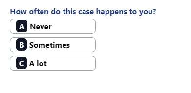
Another change this time with a vertical 3 choice list.
    <!-- Single Choice List -->
  <h4  class="mt-4 mb-1 font-bold text-blue-900 mt-5">How often do this case happens to you?</h4>
  <Rate v-model="choice" :count="3" class="flex flex-col space-y-2 cursor-pointer w-full" v-slot:default="{ current, selected }">
     <button
        @click="choice=current"
         class="block w-44 text-left px-3 py-0.5 font-bold border border-gray-400 transition transform rounded-lg cursor-pointer hover:text-gray-400"
         :class="{'text-gray-500 border-gray-500 shadow-md ring ring-gray-200': selected}">
          <span class="bg-gray-900 text-white px-1.5 rounded-md py-0.5">
            {{ letters[current - 1] }}
          </span>
          {{ choices[current - 1] }}
     </button>
   </Rate>

That's what I call maximum flexibility 👌✨. As a last improvement, we could add a wrapper component to support those three use cases and pass a prop like mode that accepts rate, scale, and choices once we have our look defined and write less code in the actual pages. I will let it to you, for practice.
You can see the example code running in Codepen
Wrapping up
Headless components provide a way to reuse the logic of components but with the flexibility of customizing the UI.
They are good for sharing complex components across projects.
It probably requires wrapper components to use your customized UI across the app in contrast to a traditional component. That will be the cost of flexibility
I hope you find it useful, let me know about any questions you have here or on Twitter. thanks for reading and have a nice day.
